


About topology and formatting of concepts presented on screen
About topology and formatting of concepts presented on screenSo here is the new interface of one of the oldest services on internet used by well hundreds of millions of users throughout the world.
We can say one thing : after 15 years while hotmail persisted to give us a textarea as large as 400x300 pixels to write our mobiletext mess... oh sorry I meant mail even on a 24 inches screen (the very same one I'm writing on at the moment), they hopefully and eventually get it right this time : yes hotmail the most important part of a webmail is ... about writing the mail indeed. Kudoos to you.
But my designers friends please oh please for the new year, have mercy and dont make anymore design where actions (links and buttons) are not represented without any discriminant topology or formatting for us to see that they are actions !
Oh ok when you put the mouse over the text a wonderful "underline" magically appears under it like we see more and more often in the « Web 2.0 ™ purified designs » but the feedback of a "hover" is not expected to be a substitute to a "naked eye" classification and discrimination between simple text and actions. This is just to signify to the user that the interface reacts to the fact that you are about to click to the action below (usually by ligthening the conect, small 3D effect, boxed effect etc...)
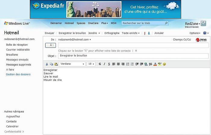
Have fun to find the list of possible actions in the attached screenshot... and the "normal" portions of completely inactive text !
I'll offer 1 hotmail account to anybody able to get everything right without having access to the real application and painfully scroll your mouse to every 10x10 pixels as I have to do when using it.
Maybe this is the latest feature in accessibility : people using screenreaders are now quicker to use the service then people blessed with good-sighted eyes...
Note : at least the ad is clear !
Note 2 : no the user is not in the "gestion des dossiers" (folders management) or in "confidentialité" (Privacy)
De l'importance de la topologie et du format des concepts à l'écran
De l'importance de la topologie et du format des concepts à l'écranAlors voici la nouvelle interface d’un des plus vieux services sur internet utilisés par bof quelques centaines de millions de gens.
On peut noter une bonne chose : après 15 ans où hotmail avait persisté en nous gratifiant d’une pauvre textarea d’environ 400x300 pixels pour écrire notre sms pardon mail même sur un écran 24 pouces ils ont enfin compris que la zone la plus importante d’un webmail est … la partie pour l’écrire. Bravo un bon point !
Par contre nos amis les designers svp comme résolution de la nouvelle année ayez pitié et ne nous faites plus des designs avec des actions (liens et boutons) sans format ni topologie caractéristique que ce sont bien des actions !
Certes quand vous passez la souris dessus le « underline » apparaît comme on le voit de plus en plus dans les « designs épurés Web 2.0 ™ » mais le feedback d’un « hover » n’est pas censé se substituer à la classification à l’œil nu (sans souris) de ces concepts sur la page, juste signifier que l’interface « réagit » à votre action d’hover (éclaircir, effet vaguement 3D, entourage etc…)
Amusez vous dans le screenshot ci-dessous à trouver la liste des actions possibles … et les simples textes totalement inactifs.
J’offre 1 compte hotmail à qui aura tout juste sans avoir accès à l’application réelle et péniblement passer sa souris sur chaque portion de 10 pixels de l’écran comme je dois le faire à chaque fois. C’est peut être ca l’accessibilité pour les malvoyants : ceux qui ont un screenreader s’en sortent mieux maintenant que ceux qui ont... de bons yeux.
Note : au moins la pub elle on la voit.
Note 2 : non nous ne sommes pas dans « gestion des dossiers » ni dans « confidentialité »